What actually moves conversion rate (and what does not)
Button colors rarely matter. Clarity, trust, and friction almost always do. Here is what we have seen move conversion rate across stores and service sites.
Conversion rate optimization has a reputation for button color tests and endless debates about hero images. In practice, the changes that reliably move conversion rate are less glamorous: making the offer clearer, removing friction, and answering objections at the right moment.
First: make sure you can measure it
Before changing anything, confirm that your analytics records every conversion once and only once. We regularly find GA4 setups that count purchases twice, miss phone calls entirely, or lose data when visitors decline cookies without consent mode configured. If the baseline is wrong, every test result is wrong too.
What usually moves conversion rate
Clarity of the offer
Visitors decide in a few seconds whether a page is for them. A headline that says exactly what you do, for whom, and what happens next beats clever copy almost every time. "Same-day boiler repair across Manchester" outperforms "Comfort, delivered."
Showing costs and timelines early
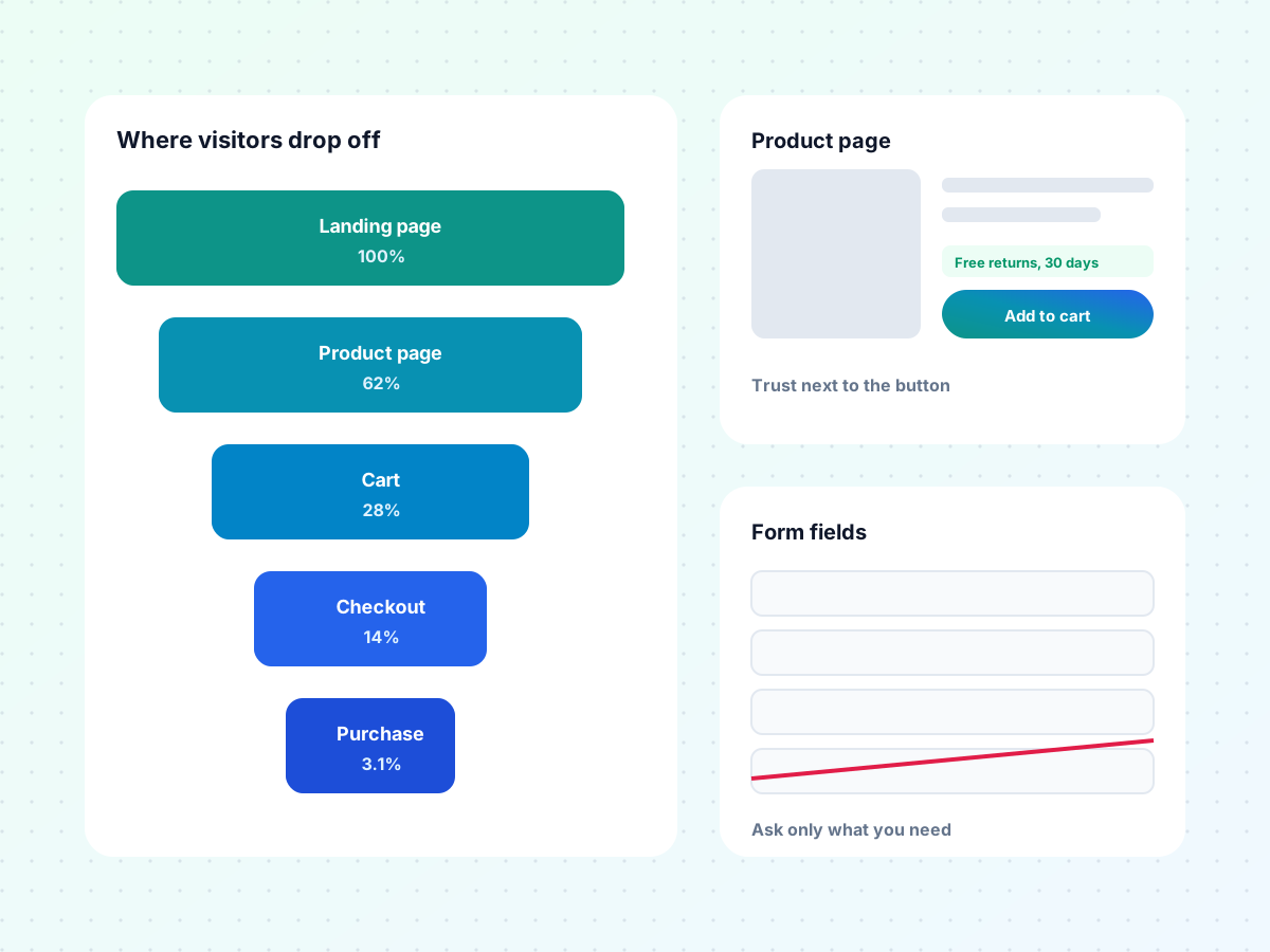
Surprise costs at checkout are one of the most common reasons people abandon. Show shipping costs, delivery times, and return policies on the product page. For service businesses, a price range or "starting from" figure filters out poor-fit leads and reassures good ones.
Fewer form fields
Every field you add costs you conversions. Ask only for what you need to respond. You can collect the rest on the first call. For multi-step forms, ask the easy questions first and contact details last.
Trust at the point of decision
Reviews, guarantees, and security information work best near the button, not in the footer. A short line like "Free returns within 30 days" next to Add to cart does more than a full returns page nobody reads.
Speed on mobile
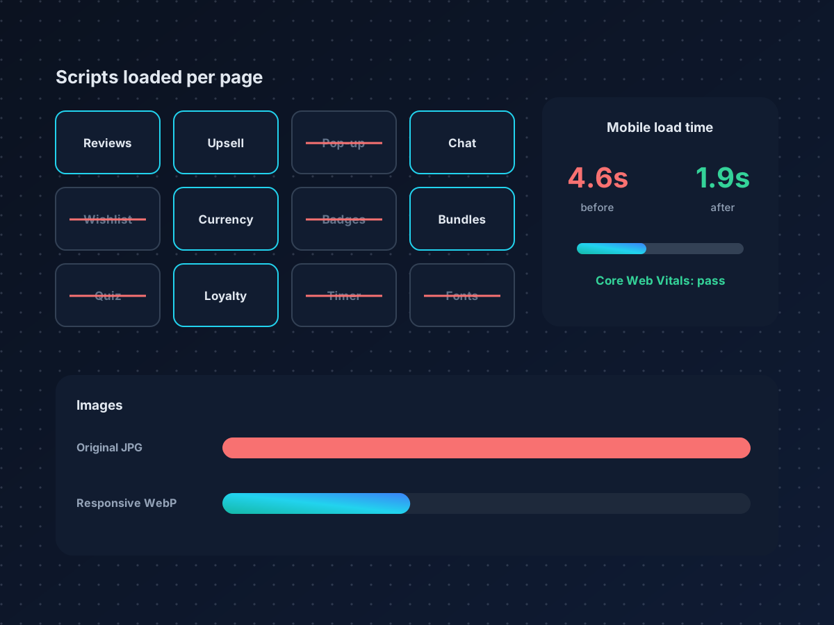
Most traffic is mobile, and slow pages lose visitors before they see the offer. Compressing images, removing unused apps and scripts, and deferring non-critical code are some of the highest-return changes you can make.
The best CRO ideas usually come from customers, not from designers. Read your reviews, support tickets, and sales call notes before you open a design tool.
What rarely moves it
- Button colors on their own, unless the current button is hard to see
- Small copy tweaks on pages with low traffic, which cannot reach significance
- Adding more pop-ups, which often lift email signups while hurting sales
- Redesigns without research, which change everything at once and teach you nothing
How to prioritize what to test
Score each idea on three things: how many visitors will see it, how strong the evidence is that it is a problem, and how hard it is to build. Start with high-traffic pages and well-evidenced problems. If you have fewer than about 1,000 conversions a month, focus on bigger changes and qualitative research rather than small split tests.
See how this worked for an online furniture retailer, or book a free strategy call to review your funnel.